Photoshop Intro. Assignment
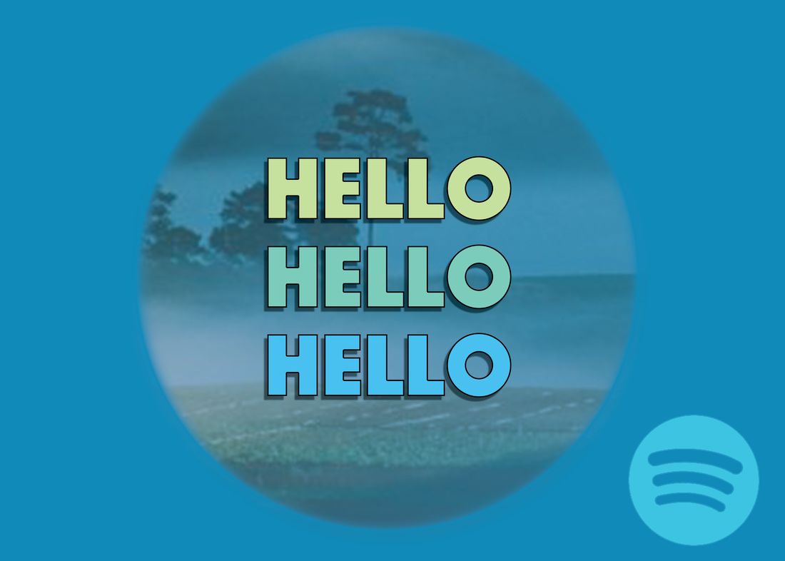
This introduction assignment was designed just to learn how to use the program, but by the end had morphed into a Spotify ad of sorts. My first step was to import a stock image of a field and some mountains to mess around with. I used the marquee tool to circle the part of the image I wanted to keep, pulled up the feather effect, and then inversed the selection and hit delete, so that I would be left only with the parts of the image in the circle. I then selected a background colour and used the command/delete shortcut to apply the colour change. Next, I chose to adjust the stock image's opacity. My next task was to crop the image to 5 by 7, and then add text. I chose a font, added a drop shadow and outline to the text, and copied it three times in different pastel colours that matched the theme I had created. My last task was to pick a logo and open it separately (I chose Spotify's), use the magic eraser tool to get rid of its background, change its colour to match my theme, save it as a png, and import it into my main project. After placing it, I saved it as a psd, flattened the image, and then saved it as the jpeg image that you are seeing now.
Advertisement: Inspiration and Influence
Shoe Advertisement Demo
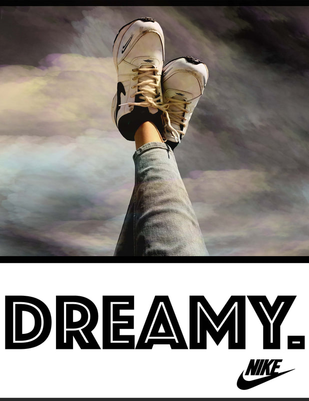
This is a demo ad created to get an idea of how I may go about creating my own original one. Here is a quick summary of the steps I took to create this:
1. Download and import the shoe image from pexels.com
2. Create a white background, and make a black rectangle towards the top where the photo will go.
3. Use the mask tool to erase the background of the shoe image (which was a sky before).
4. Import a logo, add a new mask to erase background.
5. Download smoke brushes from brusheezy.com, and import them.
6. Create various smoke layers in different colours.
7. Add the text.
I am happy with the way that this turned out, especially the use of the smoke brushes. This demo assignment has given me the experience to move on and make my own original advertisement.
Advertisement: St. Joe's Basketball
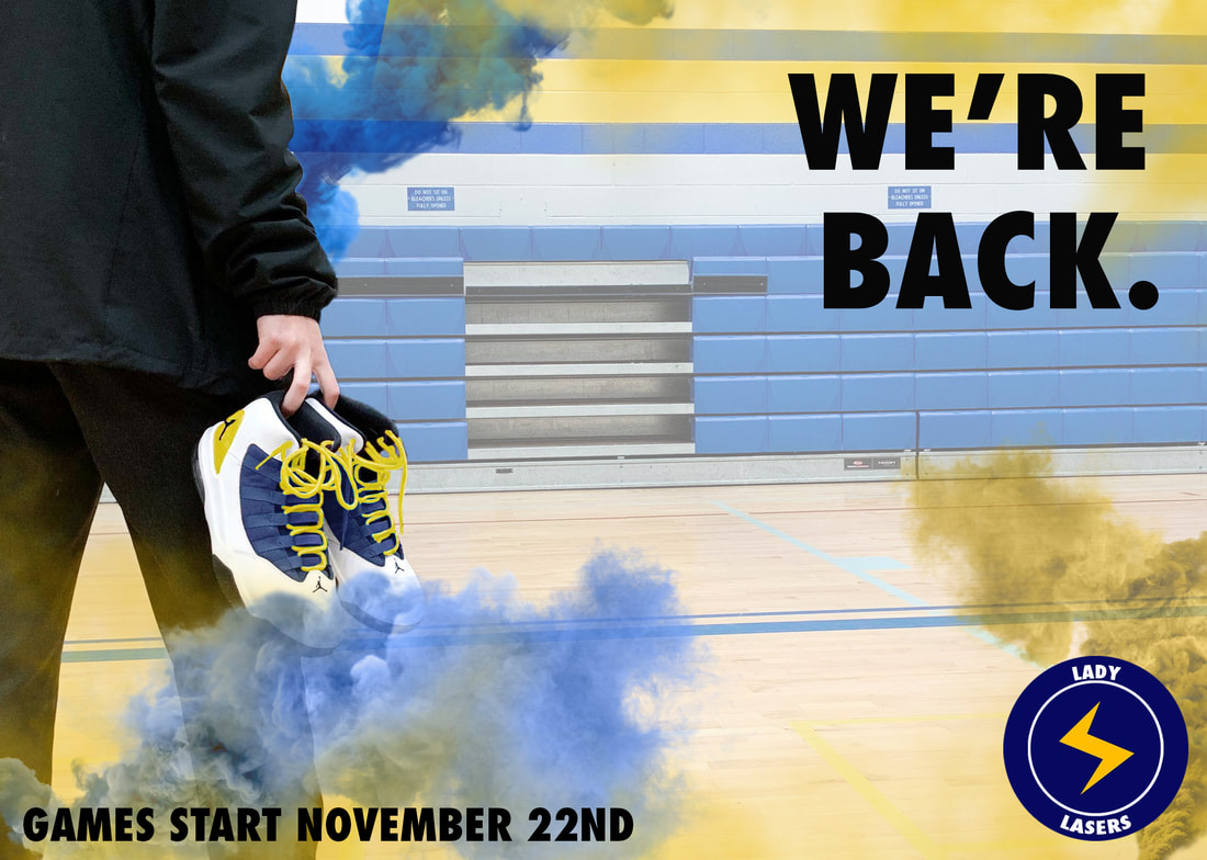
I am really happy with the way this advertisement turned out. My goal was to really get creative and think outside the box. Knowing that most people would be making shoe ads because of the shooting assignment, I decided to take it in a different direction and make an ad for St. Joe's Girls Basketball. I wanted to stick with the gold/yellow/blue school colour scheme, so I coloured the shoes to match that. The rest of the choices were made in keeping with my goal of a bold aesthetic. I chose a dark, nike-like font, used defined, bright, coloured smoke overlays, and even designed my own logo using photoshop to make sure it came across as an advertisement. I think it turned out really cool-looking, and I am really happy with the result.
Poster: Horror Movie
This is a horror movie poster that I created as an extension of the Halloween shooting assignment. My goal was to really take my time on the photo and its edits so that the poster itself could be very simple, but not underwhelming. I began with a picture of my cousin taken under purple and green Halloween lights (as can be seen above), and then decided to use her as a template for the creepy subject I would create using lightroom and photoshop. I erased the blacks of her eyes to make them entirely white, pulled up the texture of her teeth, downloaded a "pavement cracks" brush from online to use on her face, used a soft brush to create black around her eyes, took the cartoon-like skeleton pattern off of her shirt, used a "cracked glass" overlay on the photo, and adjusted the hue of the photo to create a greenish-grey glow. After I was done with these edits, I imported the image into photoshop on a black background, created a mask and used a smoke brush to reveal and conceal certain parts of the image, and then added the text to finish it. I like the image that I created, and I'm impressed with how many effects I was able to produce using the adobe software that I have learned so far. However, if I were to do something like this again I would make some alterations to the layout of the poster, to make it look more like something you would see on TV or being advertised at a theatre.
